Spark
Branding & Website Design
Rebranding Sparks: A Fresh Look for a Thriving Nonprofit
In the heart of our local community, Spark, a nonprofit organization, shines brightly with its mission to ignite and empower new business ventures and entrepreneurship. When they approached us, they were eager for a makeover that would not only give their brand a facelift but also infuse it with a newfound sense of strength and vitality.
A Typeface Evolution: Preserving Character, Adding Power
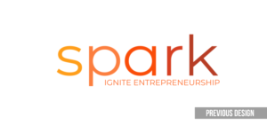
The journey began with a crucial decision – the choice of typeface. While Spark wished to maintain some of the familiar features, we recognized the need to inject vigor into their design. The solution was to enhance the typeface’s weight, creating a commanding presence that drew the eye. But we didn’t stop there; the flame nestled within the counter of the letter “a” was introduced, adding a captivating visual element. This subtle yet impactful addition symbolized unity and the rising spirit of entrepreneurship, grounded firmly like a beacon.
Energizing the Verbiage: From “Ignite” to “Igniting”
Language, too, plays a vital role in branding. We found that a simple adjustment from “ignite entrepreneurship” to “igniting entrepreneurship” better encapsulated the vibrant energy Spark embodies. This minor tweak captured the dynamic essence of Spark’s mission to foster the growth of budding entrepreneurs.
Web Refresh: Maximizing Impact within Constraints
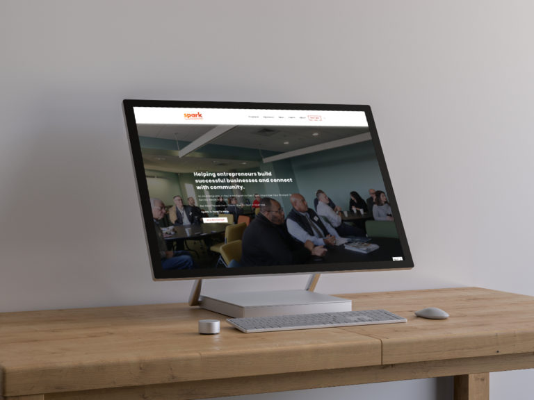
With the updated branding in place, Spark was eager to extend this fresh look to their website. However, time and budget constraints necessitated a thoughtful approach. Rather than opting for a complete website overhaul or a migration to a new platform, we decided to make strategic tweaks to their existing Squarespace site. After several layout adjustments and some customized coding, the website was primed for a relaunch that seamlessly integrated the new branding.
In conclusion, the transformation of Spark’s brand and website is a testament to the power of thoughtful design within constraints. By preserving elements of their identity while infusing fresh energy, we’ve revitalized Spark’s image and its mission. It’s a reminder that even with limited resources, a strategic and creative approach can lead to impactful change, setting the stage for a brighter future for Spark and the entrepreneurs they nurture.
